Picking
colours...those two words that can make one shudder!
I
can't begin to tell you how many people I've come across who are intimidated
when it comes to picking colours for their home or office.
I
truly believe that there are really no rules when it comes to colour. In
spite of some scary colour combinations many of us have experienced at one
time or another, I'm of the opinion that there is really no 'right or wrong'.
Colour selection is a personal thing and people should be able to surround
themselves with the hues they love. Many try to do just that, but the end result may often be nothing like what they initially envisioned.
The key to pulling
together a cohesive colour scheme in an interior is understanding the logistics
of the decorating process.
Typically the process involves
applying paint to all the required surfaces (walls, ceilings, doors, trim, etc.,) laying out furniture & rugs, hanging
window treatment and artwork and then filling the space with accessories. Most people make the common mistake of visiting the paint store
first, sorting through thousands of paint chips in all shades and tones and
then taking those select few samples home, hoping that the finished area looks
like what they'd pictured in their mind from that tiny chip. The search then
continues for fabrics and accessories to match your paint. Good luck with that.
My suggestion is to try a little different approach...but where to start? (Here's a hint: you don't need to know colour theory for this approach, because good colour combinations have already been worked out for you!)

What you need is a jumping-off point - a colour source! I find most successful spaces can often
begin with a fabric as a colour source. This could be the fabric you're using for window coverings, toss cushions, bed linens, etc. Paint colour, accent fabrics and
accessories can then be 'pulled' from your source fabric. You can also extract colour from your favourite artwork, rug, wallpaper, article of clothing, stationery, surrounding nature, or any possession that inspires you. Note: for a kitchen, where most materials are hard surfaces such as tiles and stones, I might opt to pull colours from a fabulous backsplash or countertop. This usually results in a more or less neutral kitchen, where I'd then introduce colour via a rug, window coverings, accessories, or tea towels that tie in with the rest of the scheme.
 |
| The Klimt painting was the jumping-off point or this bedroom |
Once
you have selected the shades you like from your colour source, take samples of
these to the paint store with you and begin the paint selection process. If you
cannot find that specific paint chip matching your sample don't hesitate to ask
if that store has the capability of providing a specific colour-match service.
This is available in many stores today. Once you've narrowed down your choice
don't commit to buying ten gallons just yet!
Instead,
select three shades of the same colour in sample-sized containers and test them
on your walls. Make sure to view the samples during different times of the day
under different lighting conditions as different light sources/levels can really change the look of a colour. I learned this the hard way (in my early days) when a beige colour I had chosen for a room turned lilac under artificial lighting. Keep in mind also that different sun exposures can have a different effect on colours, most notably from northerly and southerly locations. Rooms with northern exposure generally feel cooler, so cool colour combinations here can intensify the cold effect and conversely warmer colour combinations can help make the space feel warmer. The opposite effect takes place for the southern exposure; warmer is intensified and the use of cooler colours acts to reduce this effect.
 |
| Source: House to Home |
 |
| Source: Style at Home |
 |
| Source: House to Home |
If
your house or office is large enough you can try painting rooms with different
colours but pulling them together with a common accent colour throughout. Don't
forget that similar themed accessories can also achieve this 'pulled-together' effect. For smaller spaces or rooms that
open through to one another it can be a bit tricky as you run the risk of
making it look choppy [by painting rooms in different colours.] Unless you’re a seasoned decorator, it is
often best to carry through a common element on prominent surfaces such as using
one flooring material or a single colour on the walls.
 |
| One of the best-kept designer secrets: ceilings. Treat the ceiling as the fifth wall and you've just created another surface for pulling together a colour scheme! Note that you need to provide extra lighting in spaces with ceilings painted a colour other than white, as other colours reflect less light into the area. Source: Tradional Home |
In
my own practice, I tend to use neutral colours on the walls and on large
investment pieces and let them be the backdrop to colours found in accents and accessories. The reasoning is quite logical: we can grow tired of a colour scheme from
time to time; and it can be a pain having to repaint an entire space or
replacing those expensive sofas. Accents
and accessories can be switched out for a relatively small cost (and barely any
effort) while allowing you to achieve a completely different look.
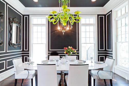 |
| Are you colour shy? A black and white combination is always a safe bet! Photography by Jonathan Calvert |
Want to understand a little more on colour theory and colour psychology? Check out these interesting articles,
Colour Your World Happy from Style at Home, and
What Your Paint Colour Says About You from Real Simple.
Warning: Colour does not exist without light and a brilliant colour scheme can only be appreciated with great lighting. Indicentally, I happen to have a great article on this subject, called
Interior Lighting, Simplified.


